GDES2014 – Children’s Book Design – Main Brief Final Concepts

GDES2014 – Children’s Book Design

WW1 Children’s Cookery Book Brief

This will be my final entry for this module as the deadline for submission is tomorrow.  I have included pictures of my final artwork for submission.

The Cover

After trying a few different options,  I ended up discarding this design as I felt tit was perhaps too sophisticated for the audience and that it wasn’t fun or engaging enough for your average 9-11 year old.

My final design features the famous ‘V’ for Vistory symbol, but with a twist. I used the carrots to suggest the cookery & home grown theme. I have used the sort of imagery that evokes a feeling of a bygone era. It demonstrates an aged look, patriotic undertones but also child like fun.

The typography originally looked too sterile and I noticed that a lot of children books feature playful type, so I did the same with the word “kitchen”. Private Pigeon also features on the front and rear covers, inviting the reader to don an apron and join him to cook.  Overall I wanted to create a feeling of fun and interest. The colour palette is drawn from the union jack, but aged to look old, but with a modern twist.

The Spread

The first and perhaps most important thing I setup on the spread was the grid an column structure. As I have an interest in publication and layout, I spent a lot of time researching grids and layout techniques, which unltimately informed my design.

I used the left page as an introduction to the recipe, but also to add some background, educational information. I used WW1 related imagery and illustrations throughout, such as the Sopwith Camel bi-plane, with a fun cloud typography treatment. The grid came into it’s own on the right hand page, which shows a sequential recipe to follow. I used medals to show which step you are on and old style postcards for the information, as the soldiers would have sent home from the trenches.

The background elements feature an authentic WW1 map, distressed/grungey textures and poppy fields.

I incorporated user testing here too. The feedback was helpful and actually informed the design somewhat, mostly typographical changes to improve legibility and to support the way children learn at school, i.e. using uppercase first letter and then lower case as opposed to all uppercase titles.  Overall I’m pretty happy with the way it turned out and the user feedback definitely helped refine it further

Activity Sheet

Continuing the ‘egg’ theme from the spread, I decided to create a drawing/colouring worksheet where the reader get’s to decorate their own egg, as the children of WW1 did. Private Pigeon offers some education information, whilst the decorative elements offer a little fun and inspiration to little minds.

Mock ups

I also created a few mock-ups to give a visual representation of how the finished articles may look. I also included the iPad mockup to show how an ePub or ebook may look.

GDES2014 – Children’s Book Design – Main brief – Part 6

GDES2014 – Children’s Book Design

Main Brief – Roughs and concepts

This post shows the contents of my sketchbook for this brief.  Here you can see my creative process, from mind mapping to character development, layout to cover design.

Mind Mapping

Character Development

Layout & Further Cover Ideas

GDES2014 – Children’s book design – Main brief part 5

GDES2014 – Children’s book design

WW1 recipe book – Researching children activity sheets

Part of the brief is to produce an activity sheet for children to complete, that ties into the theme of the spread and the book covers.

Puffin Books have a whole section of their website dedicated to children activity sheets, often based on the most well know characters like Willy Wonka or Diary of a Wimpy Kid.  Some of the activities include:

  • Plan a birthday party, with invites and create your own Willy Wonka top hat.
  • Wimpy kid – follow the lines to connect 2 items, spot the difference, suduko, colour in a kids shirt, how many words can you make from the phrase “Summer-Holiday”?
  • Charlie & Lola – Design Lolas dress, colour in silly hats, snap.
  • Others include colouring sheets, mazes, stickers, certificates, hidden objects etc.

http://www.puffin.co.uk

I like the idea of a certificate or award that the child can personalise.  I think an activity sheet with multiple things to do would be fun.

  • Pull the pin from the egg grenade
  • Make words from “Victory in the Kitchen”
  • Something to do with carrots or vegetables
  • Decorate your own egg etc
  • Recognise the different nations by plane markings
  • A mix of interesting facts and activities?

I found a number of examples of activity sheets that I like or could use in the creation of my own.


GDES2014 – Children’s Book Design – Main brief part 4

GDES2014 – Children’s Book Design

WW1 Recipe book brief – Further research

Existing Books

I looked at a number of children books as well as cookery books, Design books and historical references to the First World War.

The Cheeky Monkey book shows a good example of added features with the glove puppet plush toy that goes through the centre of the book.

The Roald Dahl books show very bold colours in the background and type elements, with Quentin Blakes simple illustrations over the top.  This creates a strong divide between the left and right of the cover but is then joined by the book title at the bottom that reads more traditionally (horizontally).

The David Walliams books feature Tony Ross’s amazing illustrations.  Each cover is similarr in that the top banner area is taken up by the authors name and then a large illustration below it.  Again strong colours are used for the backgrounds, but also feature some pattern elements such as stars.  The rosette is a nice touch too, which I may apply to my own design in the form of a medal.

I picked up the other books as they all feature some design elements that I feel may inspire my own cover design.  The Fateful year cover for example, features a lot of semiology to the time period from the type, to the illustration style, washed out colours and patriotic theme (flags, English Rose, Poppies etc).  I like the idea of using silhouettes as featured on “stories of the first world war”, perhaps in the form of a farmer digging, soldiers marching to war, standing over a grave etc.

The Line of Fire book is an illustrated diary and features a really nice, rough illustration style, which captures the gritty/dark nature of the time period.


GDE2014 – Children’s Book Design – Main brief Part 3

GDE2014 – Childrens Book Design

WW1 recipe book brief – Further research

20th Century Design Movements – Timeline

1850-1914: Arts & Crafts Movement

1880-1910: Art Nouveau

1897-1905: Vienna Secession

Modernism

1907-1935: Deutscher Werkbund

1909-1930: Futurism

1916-1923: Dada

1917-1935: Constructivism

1917-1931: De Stijl

1919-1933: Bauhaus

Economic and Political Influences

The beginning of the twentieth century was fraught with radical political, social, cultural and economic changes. It was a revolutionary time. It was a time of major scientific and technological advances. Life was being forever changed by the invention of the automobile, aeroplane, motion pictures, radio and weapons (tanks, machine guns, chemical and biological warfare). Art Deco was a reaction to the rigours of World War I and was an attempt to develop a more positive and contemporary society.

Indeed the subject matter of a lot of Art Deco posters were designed to celebrate society’s progress in technology. The world wars had a significant impact on graphic design. Poster design during

World War 1 was highly influenced by political views and national pride. Propaganda was used to spread a message to the audience, as the war was the main focus of society.

patriotic

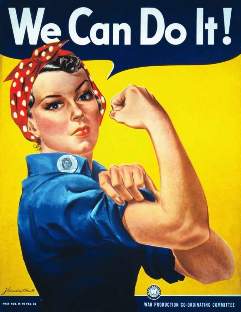
The poster design sample in Figure 3.29 demonstrates the designer’s attempt to influence the audience by draping a woman in a flag and using provocative language to send a message to the viewers. The period between the world wars saw a society in disarray and economies in ruin.


Source – https://visscom.wordpress.com/2013/04/07/20th-century-design-movements/

I then further researched each of these movements individually to see if I could incorporate the design style into my design.  The movements that are of most interest to me from an aesthetic viewpoint are Modernism in general, Dada and Constructivism.  Constructivism lends itself particularly well to the time period as it featured heavily in propaganda of the time, most notable Russian.

Modernism

With the advances of technology Modernism began to break through at the end of the 19th century into the beginning to the 20th century. Western society began to develop new ways to shape human culture and improve the constructed environment.

Modernism covered many creative disciplines from design and art to influencing architecture, music and literature. The power of machines forced artists to strategically re-think their practice, the results were revolutionary and still influences designers to this very day. This new technology provided the opportunity for mass production, and the machine itself became a theme in modernism.

Influential designers of this period range from Walter Gropius from the Bauhaus to the modern architect Le Corbusier, both men were fascinated with all disciplines of design and it reflected greatly in their work.

Modernism is arguably being the most influential movement of the 20th century.

Kandinsky

A beautiful poster celebrating the use of sans-serif typography and white space

Graphic Design and Typefaces

Modernism especially changed the thinking process for communications, graphic design and typography, the style of design shifted drastically from the prior 19th century approach. Before the concept of Modernism, graphic design and typography was ‘overly decorated’ and elaborate, every possible inch of a typical poster would be filled with imagery and type.

Designers of the era of Modernism abided to strict, structured grid system with emphasis on negative space, just as important was the use of clean sans-serif type. The idea was to create strong graphics that were against commercialism, greed and cheapness.

Typical typefaces used in the Modernism era include:

Franklin Gothic,

Monotype Grotesque, (cannot find free version)

Futura,

Helvetica Neue.

Dutch artist Theo van Doesburg practiced painting, architecture and poetry – he also influenced graphic design and is considered the ‘ambassador’ of the movement De Stijl. He described Modernism times as: “Art should not deal with the ‘useful’ or the ‘nice’, but with the ‘spiritual’ and the ‘sublime’. The purest art forms do not cause the decorative change of some detail from life, but the inner metamorphosis of life, the revaluation of all values.”

Source – http://www.creativebloq.com/graphic-design/easy-guide-design-movements-modernism-10134971

Jan Tschichold copy

Jan Tschichold (1902 – 1974 ) was born in Leipzig, Germany. Tschichold moved to the center stage of graphic design as a major champion of the modern typographic style during its infancy. But it is his later work—which had moved on from the exclusive use of asymmetrical design and sans serif typefaces, to a classical approach—that caught the eye of Penguin founder Allen Lane during the late 1940s, leading to three years of Tschichold holding the creative reins of the infamous publishing house.

When Jan Tschichold designed his posters he widely expresses the avant-garde ideas of the or New Typography, which were strongly influenced by the Bauhaus.

Source – http://guity-novin.blogspot.co.uk/2012/03/history-of-type-face.html#Eleven

Dada
M4623685613e50b9586bbfd0b5f97993f

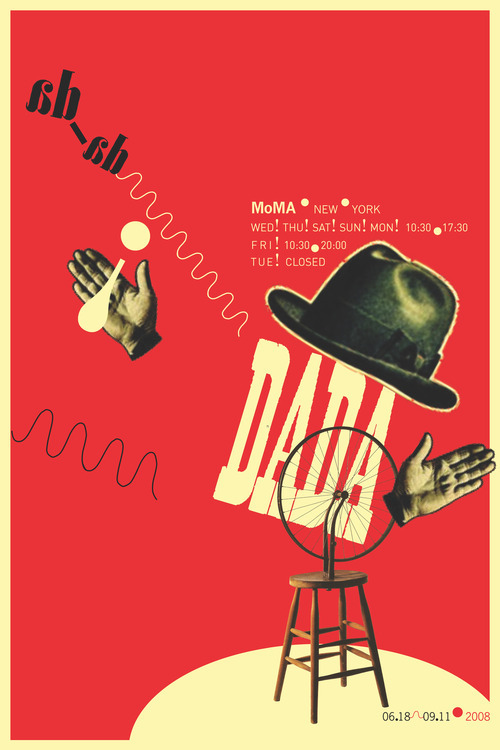
The collage artists, Max Ernst, Man Ray and others taking the clue from Cubism were instrumental to the development of the movement called Dada. Dada was an early 20th-century international movement in art, literature, music, and film, repudiating and mocking artistic and social conventions and emphasizing the illogical and absurd. Dada was launched in Zurich in 1916 by Tristan Tzara and others, soon merging with a similar group in New York. It favored montage, collage, and the ready-made. Leading figures: Jean Arp, André Breton, Max Ernst, Man Ray, and Marcel Duchamp.

Constructivism

rodchenko_books

A movement with origins in Russia, Constructivism was primarily an art and architectural movement. It rejected the idea of art for arts’ sake and the traditional bourgeois class of society to which previous art had been catered. Instead it favored art as a practise directed towards social change or that would serve a social purpose. Developing after World War I, the movement sought to push people to rebuild society in a Utopian model rather than the one that had led to the war.

The term construction art was first coined by Kasmir Malevich in reference to the work of Aleksander Rodchenko. Graphic Design in the constructivism movement ranged from the production of product packaging to logos, posters, book covers and advertisements. Rodchenko’s graphic design works became an inspiration to many people in the western world including Jan Tschichold and the design motif of the constructivists is still borrowed, and stolen, from in much of graphic design today.

Source – http://www.designishistory.com/1920/constructivism/

De Stijl

039/ML

039/ML

Dutch for The Style, Die Stijl was founded in 1917. The artists most recognized with the movement were the painters Theo van Doesburg, who was also a writer and a critic, and Piet Mondrian, along with the architect Gerrit Reitveld. The movement proposed ultimate simplicity and abstraction through which they could express a Utopian idea of harmony and order.

The harmony and order was established through a reduction of elements to pure geometric forms and primary colors. Die Stijl was also the name of a publication discussing the groups theories which was published by van Doesburg. The publication Die Stijl represents the most significant work of graphic design from the movement, but the ideas of reduction of form and color are major influences on the development of graphic design as well.

Source – http://www.designishistory.com/1920/de-stijl/

Futurism

logbookcover

Futurism was not only an art movement but also a social movement that developed in Italy in the early 20th century. Futurists were well versed and practiced in nearly every field of art including painting, ceramics, sculpture, graphic design, interior design, theater, film, literature, music and architecture. It was a movement that particularly despised not just certain aspects of classical antiquity, but everything that was not totally new.

The painters of Futurism were particularly successful but much of the ideas of the movement were generated through writing and several manifestos of futurism were published. They often broke light and color down into a series of dots or geometric forms through a process called divisionism. Futurism influenced many modern art movements of the 20th century which in turn influenced the development of graphic design. The writings, philosophies and aesthetic characteristics of futurism have been particularly influential to designers.

Source – http://www.designishistory.com/1850/futurism/


GDES2014 – Children’s Book Design – Brief part 2

GDES2014 – Children’s Book Design

Main Brief Research

Eggs & WW1

The National Egg Collection for the wounded was started in August 1915. Its patron was H.M. Queen Alexandra.It aimed at first to collect one million eggs for the wounded. The scheme proved to be very successful actually achieving an average of one million eggs a month. In February 1917 during a special “Children’s Week” 300,000 eggs were collected when the weather was very bad and eggs scarce.

By January 1918 the scheme had sent over seven million eggs to hospitals at home and over twenty five million to hospitals abroad.

Source – http://longstowe.ccan.co.uk/content/catalogue_item/ww1-national-egg-collection

Egg Grenades

WW1 German egg grenade

WW1 German egg grenade

The ‘egg’ grenade (‘Eierhandgranate’) appeared in the beginning of 1917, as a complement to the other reglementary grenades that were either too heavy (Kugelhandgranate) or too cumersome (Stielhandgranate) for the assault sections. The small size steel cast body (6 cm long, 4.6 cm diameter), took the shape of an egg, therefore giving this grenade its nickname.

Initially entirely smooth, the body was modified in 1917 to receive a fragmented belt (‘Eierhandgranate Neuer Art’ – n/A) to improve its handling. Its size and weight allowed a long range hand launching (up to 50 meters) and as easy transportation in big quantities, even in the battledresses pockets.

Source – http://www.passioncompassion1418.com/decouvertes/english_grenades_all.html

As WWI progressed, there was a need for a smaller grenade, something more portable than the heavy Kugel and less cumbersome than stick types.

Development started in late 1916 which lead to the introduction of the cast iron “Egg” grenade, Mle.1917. It was loaded with black powder, or other explosive fillers. The average soldier could be expected to reach distances of over 40 meters, which meant the Eierhandgranate could be used in an offensive role as well as defensive.

Source – http://inert-ord.net/gerimp/eggs/index.html

How did children help the War Effort?

Between 1914 and 1918, everyone was expected to ‘do their bit’ to help with war work. Many British children were very keen to lend a hand. They wanted to support their fathers and older brothers who were away fighting at the Front.

Young people did many jobs. Around the home they would look after younger brothers and sisters. They helped with housework, carrying water and chopping firewood. They also joined long queues for food in the shops. Food was scarce because German U-Boats (submarines) were sinking the ships bringing supplies to Britain. ‘Growing your own’ became very important. Children helped dig and weed vegetable patches and worked in the fields at harvest time.

Flag Days

‘Flag days’ were held to make money for all kinds of wartime projects. Children would sell little flags or badges that people could pin to their coats. This raised money for funding the war effort, for example to build warships, or to help wounded soldiers. There was even a Blue Cross fund to help horses hurt in battle.

Children collected other things that would be useful for the war effort, such as blankets, books and magazines. These were sent to the soldiers at the front.

Animals at war

war elephant

Even animals were given war work to do. Horses were sent into battle to carry soldiers, or drag wagons and big guns to the front. Homing pigeons carried paper messages, put into little tubes and strapped to their legs. Dogs guarded important places, carried messages and took first aid supplies out to wounded soldiers on the battlefield.

On the Home Front, elephants were taken out of zoos and sent to pull heavy loads on farms.

Source – http://www.bbc.co.uk/schools/0/ww1/25307613

Evacuation

evacuees

It seems from my research that evacuation did not take place in large numbers during WW1.  I suspect this due mainly to the fact that although the zeppelins caused a threat and later, the biplane bombers, the numbers were too few to cause the concern that was so apparent during WW2.  The main threat was also focused in the capital.

It would appear that many families took children away from London to places that were safe from bombing threat, but often this was off their own back as opposed to due to government led evacuation.

 Evacuation Plans

In preparation for the war, evacuation plans were put into consideration to avoid possible danger on children. Primary children, toddlers under five and moms were evacuated from predicted danger zones to safer areas. 4 million evacuees were expected to leave, however only 1.5 million left, yet it was still considered a mass migration of many immigrants. Kids held their labeled luggage, waved good-byes to their families and plodded into the unknown.

Source – https://sites.google.com/site/worldwar1class1/life-on-the-home-front/children-during-ww1

Rationing and World War One

Rationing was introduced into Britain at the tail end of World War One – in February 1918. Rationing was introduced in response to an effective U-boat campaign and during World War One, the Defence of the Realm Act (DORA) was used to ensure that food shortages never occurred.

One of the primary aims of DORA, when it was first introduced, was to prevent food shortages. At the start of the war, food shortages were self-imposed as the German U-boat campaign had yet to start. However, at the start of the war people went around panic buying food and hoarding it at home. Some shops sold out of food in days in August 1914. However, after the initial panic buying, people settled down into a routine and food was not a problem until the end of 1916.

Britain continued to import food during the war. The main exporters to Britain were America and Canada. This meant that merchant ships had to cross the Atlantic Ocean. Up to 1916, these merchant ships could travel in relative safety. However, in 1917, the Germans introduced unrestricted submarine warfare and merchant ships were sunk with great frequency. This had a drastic impact on Britain’s food supply and with great losses in the Atlantic, food had to be rationed so that no-one starved in Britain. In April 1916, Britain only had six weeks of wheat left and bread was a staple part of most diets. 1916 was a bleak year for families – with the news from the Battle of the Somme and with food in short supply, suddenly the war was brought home to most families. Food prices rose and by October 1916, coal was in such short supply that it was rationed by the number of rooms a family had in its house.

The restrictions introduced by DORA failed and the government then tried to introduce a voluntary code of rationing whereby people limited themselves to what they should eat. The standard was set by the Royal Family. However, this did not work. Those who worked in the munitions factories did not have enough food while anyone with money could get more than enough food on the black market. Any area that could grow food was converted to do so – gardens were turned into allotments and chickens etc. were kept in back gardens.

The powers introduced by DORA empowered the government to take over land when it felt that it was necessary to do so. In 1917, the government took over 2.5 million acres of land for farming. By the end of the war, Britain had an extra three million acres of farming land. Those who would have usually worked the land – young men – had been called up, so the work was done by the Women’s Land Army. Conscientious objectors also worked on the land.

Despite the importance of the work done by the Women’s Land Army, the government still felt that it was appropriate to warn them about the standards expected of them and their approach must have seemed very old fashioned to some:

“You are doing a man’s work and so you are dressed rather like a man; but remember that because you wear a smock and trousers you should take care to behave like an English girl who expects chivalry and respect from everyone she meets

Despite the work by the WLA, the impact of the German U-boat campaign made food shortages a serious problem by 1918. Malnutrition was seen in poor communities and as a result the government introduced rationing in 1918. Food products were added to the list as the year progressed. In January 1918, sugar was rationed and by the end of April meat, butter, cheese and margarine were added to the list of rationed food. Ration cards were issued and everyone had to register with a butcher and grocer. Rationing was a clear indication to the British public that all was not well, but it did work. The malnutrition that had been identified in the poorer communities disappeared and as in World War Two, no one actually starved in Britain during the war.

Source – http://www.historylearningsite.co.uk/rationing_and_world_war_one.htm

GDES2014 – Children’s Book Design – Main Brief Part 1

GDES2014 – Children’s Book Design

Main Brief – Research

Grids & layout

As the brief for this module is to produce a spread and a cover for a book, I felt it important to consider effective layout and of course the underlying grid structure.

I found a number of resources online as well as in book from my own collection and from the Hive.  I have “pooled” some of that information here.

Using layout grids effectively

There are two main types of layouts: vertical or landscape. There are also only two types of grids. One that has an even number of columns and one that has an odd number of columns. An experienced designer knows that a specific style of design can only be achieved by an odd number of columns, or alternatively, by using an even number of columns. Illustrated below are common examples of layouts using basic layout grids. Learning to choose the right grid for your design is crucial to its success.

Here are examples of basic vertical layout grids

1 column vertical grid

2 column vertical grid

2 column vertical grid

3 column vertical grid

3 column vertical grid

3 column vertical grid

Here are examples of basic landscape layout grids

1 column landscape grid

 2 column landscape grid

 3 column landscape grid

3 column landscape grid

4 column landscape grid

4 column landscape grid

Adjusting Your Layout Grid for Your Binding Type

It’s important, as you create your layout grid, that you pay special attention when choosing the type of binding to compensate for the gutter. We’ve all had the experience of losing content in the gutter of a publication, at one time or another, and have learned this lesson the hard way. Illustrated below are examples of a perfect bound spine and a double-page layout grid, where the gutter has been taken into consideration and the proper adjustment made.

The gutter is the blank space between two facing pages. The gutter space is that extra space allowance used to accommodate the binding in publications. It needs special attention because it is not always usable for design and will affect legibility in most cases. For example, a perfect bound spine will take about a ¼” for the glue, so you should consider the first ½” as non-usable. Any type of Wire-O™ or spiral binding, which make it possible for the document to lay flat when open, will have either drilled holes or punched squares for you to consider. With these specific bindings, the first 3/8” should be considered as not usable or illegible space. On the other hand, the gutter of a saddle stitch binding will not have this problem and can easily have an image or text run though it without any legibility issues.

The Rule of Thirds

This rule is used by professional photographers the world over. The rule of thirds works by splitting an image into thirds, so you end up with 9 equal sections, then simply place your main subject where the lines intersect.

The Golden Ratio and the Fibonacci Sequence

The Golden Spiral is based on the Golden Ratio while the Fibonacci Spiral is a spiral based on the Fibonacci Sequence. Both are very similar, and can be used as a compositional tool.

The Golden Spiral

The Fibonacci Spiral

The Golden Ratio is also known as the divine proportion. In mathematics and the arts, two quantities are in the Golden Ratio if the ratio of the sum of the quantities to the larger quantity is equal to the ratio of the larger quantity to the smaller one. Also In mathematics the Fibonacci Sequence are 0 and 1, and each subsequent number is the sum of the previous two: 1, 1, 2, 3, 5, 8, 13, 21, 55, 89,144, etc.

Always start your design project with a layout grid. No exceptions.

If you don’t, you’ll never be able to repeat that look consistently. Your projects will never have visual harmony and, like anything which lacks structure or a strong foundation, your concepts will be visually inconsistent from one product to another and will always be a struggle to produce. Without a layout grid, graphic elements will not properly work together.

Any high-quality design project, campaign or identity/branding system needs a strong, tested and perfected layout grid system to make it possible to split the work to many designers at one time, so that they all produce the same quality end result with consistency and visual harmony. A layout grid is the invisible force that gives the visible its structure and holds everything in its proper place.

Source – http://www.designersinsights.com/designer-resources/using-layout-grids-effectively

 A little more on the Golden Ratio

The whole concept of a definitive grid ‘system’ is a relatively recent invention in the world of design. Grids have existed intuitively since the earliest days of man drawing and writing, but it’s only recently that layout has been considered in a scholarly fashion, and as such they’ve never existed in isolation from other best-practice, well understood layout tools. One such example of cross-over is where the golden ratio meets the grid.

The golden ratio (also known as the golden mean) determines the most pleasing set of proportions for an element, and is simplified to the ‘rule of thirds’. When used in combination with a grid, these simple rules for size, position and proportion can help ensure a layout feels both coherent within itself, but also appealing aesthetically. Why would you want to appeal in these terms? Because by doing so, you’re making the content more accessible to the reader. Remember that a grid is the invisible glue behind content – in most cases it should be transparent to the viewer.

Source – http://www.creativebloq.com/web-design/grid-theory-41411345

My Pinterest boards

I use Pinterest as a source of inspiration for all of my projects, so rather than post too many pictures here you can have a look at my image research by following the links listed below.

Book Cover Design

Screenshot 2015-04-04 15.54.38

link – https://uk.pinterest.com/scottrw2002/book-cover-design/

Layout Design

Screenshot 2015-04-04 15.55.13

Link – https://uk.pinterest.com/scottrw2002/layout/

Publication Design

Screenshot 2015-04-04 16.06.43

Link – https://uk.pinterest.com/scottrw2002/publication-design/

GDES2014 – Childrens Book Design – Week 4

GDES2014 – Childrens Book Design

For this weeks task, we were asked to follow a recipe from a list of WW1 inspired cookery.

I decided to work with Laura and Gintare on this task so that we could share the experience together, as well as allowing me to take photo’s as we followed the recipe.  It was a great fun afternoon.

We chose to bake the eggless sponge as I was curious as to how this would taste and also if it would rise the way a normal cake would.  We sourced the ingredients locally and easily.

The recipe was incredibly easy to follow and we had no major hiccups.  The only issue was that following the recipe to the letter resulted in only enough mix to fill one cake tin.  I had the idea to cook just the one sponge, cut it in half and stack it for the purposes of creating a sandwich.  It also meant it was nicely resented for the photographs.

The cake tastes surprisingly good, although incredibly sweet.  I don’t know if the amount of sugar the recipe suggested was too much or if combining the honey was a tad too much.  The original recipe suggest golden syrup though, so I’m guessing they had very sweet tooth around the time of WW1.

In total we probably spent just over an hour preparing the ingredients, following the recipe, taking photographs and allowing for baking time.  I don’t think it would take as long if I made it again as I wouldn’t be taking photographs and with three of us in the kitchen, we were probably getting in each others way…. Too many cooks and all that!

I can imagine that this recipe would have been popular during WW1, possibly even a little luxurious given the limited choices available back then.  With different fruit jams adding to variety I imagine this would have bought a little cheer to otherwise grim times.  Few, simple ingredients and surprisingly tasty results, definitely a winner!

I have put together an A4 document showing the stages of the recipe as well as the final product.

WW1 Cake Recipe