GDES3003 – Green Design – Major Brief Research – Part 2

GDES3003 – GREEN DESIGN

Major Brief – Research – Part 2 – Sustainability

Sustainable Food

A sustainable food system is one that is cultivated with the long-term health of soil and, water and ecosystems in mind; a sustainable food system features safe working conditions for farmers and farmworkers; and a sustainable food system nourishes our body for a lifetime of health.

Allotments

An increase in urban allotments could help us meet the rising demand for food throughout the world, without damaging the Earth’s soils.

One of the greatest challenges facing the growing human population is meeting rising demand for food without undermining the soils on which food production – and other services such as carbon storage, flood mitigation and locking up pollutants – depends.

However, the heyday for allotments was during World War Two, when 10 per cent of the UK’s food came from less than 1 per cent of its cultivated land thanks to the expansion of own growing under the Dig for Victory campaign. At that time, one in three households in Leicester had an allotment but following a national decline in demand, today Leicester’s allotment plots number only 3200 and cover just 2 per cent of urban green space although the city is the second highest provider of allotments nationwide.

As well as improving food security, studies show that own-growing has direct physical and mental health benefits, and can provide access to sustainably produced fruit and vegetable crops without the associated food miles.

(Source – http://facultyofscience.shef.ac.uk/allotments-could-be-key-to-sustainable-farming-study-finds/)

  • The Dig for Victory campaign & associated imagery/style could be used to brand the allotment space in a fun & interesting way.

Owning your own allotment can be a very sociable experience and can also improve both physical and mental health. Just 30 minutes of working on your allotment can burn around 150 calories! Time spent out in the sunshine boosts vitamin D levels (but remember to top up your sunscreen) and this enjoyable activity is also known to increase serotin levels, making you feel happier and healthier.

The environmental benefits are also significant, with food miles and your carbon footprint being reduced by eating locally and seasonally and being able to walk to and from your nearby plot. Allotments provide essential habitats for wildlife in urban communities, helping to increase biodiversity in built-up areas.

(Source – http://www.sustainablemerton.org/benefits-of-allotment-gardening/)

Additional Links

I have included a number of additional sources of information, many of which we have investigated during lectures are that have been recommended by the course tutor.

Measuring your own Carbon Footprint (or getting an idea of) at:
http://footprint.wwf.org.uk/

The Story of Stuff with Annie Leonard: Excellent 20 min film – role of advertising, ‘work, watch, spend’ cycle, commercialism & planned and perceived obsolescence etc..
https://www.youtube.com/watch?v=9GorqroigqM

TED – Are Mushrooms the New Plastic? (2010) (10 mins).
http://www.ted.com/playlists/28/sustainability_by_design.html

TED – Paper Beats Plastics? (18 mins)
http://www.ted.com/playlists/28/sustainability_by_design

Reading List

I have also looked at numerous printed resources, including:

  • Designing Sustainable Packaging – Scott Boylston
  • Eco Packaging Design

GDES3003 – Green Design – Main Brief Research & Roughs

GDES3003 – GREEN DESIGN

Main Brief Research 3 – Packaging (Green & Otherwise)

Definition of Sustainable Packaging

The criteria presented here blend broad sustainability and industrial ecology objectives with business considerations and strategies that address the environmental concerns related to the life cycle of packaging. These criteria relate to the activities of the packaging value chain and define the areas in which we actively seek to encourage transformation, innovation, and optimization. We believe that by successfully addressing these criteria, packaging can be transformed into a closed loop flow of packaging materials in a system that is economically robust and provides benefit throughout its life cycle—a sustainable packaging system.

Sustainable packaging:

  1. Is beneficial, safe & healthy for individuals and communities throughout its life cycle
  2. Meets market criteria for performance and cost
  3. Is sourced, manufactured, transported, and recycled using renewable energy
  4. Optimizes the use of renewable or recycled source materials
  5. Is manufactured using clean production technologies and best practices
  6. Is made from materials healthy throughout the life cycle
  7. Is physically designed to optimize materials and energy
  8. Is effectively recovered and utilized in biological and/or industrial closed loop cycles

(Source – http://sustainablepackaging.org/uploads/Documents/Definition%20of%20Sustainable%20Packaging.pdf)

Further research on sustainable packaging can be found in one of my previous blog posts – See here

Sustainable Packaging Materials

The company London Bio Packaging produce all manner of eco food packaging products.  Some of the more popular materials are:

  • Bio Plastics – Plastics made from plants
  • Plant Starch – Plant Starch Material (PSM) is a flexible bio based packaging material which has not been refined into a bio-plastic
  • Sugar Bagasse – Waste material produced once sugar cane has been harvested for the sugar syrup is called bagasse
  • Recycled Plastic – rPET (recycled polyethylene terephthalate) is the most common plastic that is being recycled back into primary applications
  • Recycled Paper – Sustainable forest paper ensures that the forests from which the paper comes and managed so as not destroy the forest, to promote biodiversity and protect any indigenous peoples
  • Forest Wood – wooden products are made from renewable plant resource which can be formed into a variety of packaging and products
  • Palm Leaf – Products are natural, compostable and biodegradable. They are very stylish, tough and heat resistant

Palm leaf is really interesting as it has the potential to be very beautiful, hard wearing and is completely sustainable and natural.

London Bio describe it as:  Wholeleaf products have no pulp, no starch, just a washed and pressed leaf. The palm leaf itself varies in thickness from 2 to 4mm, as well as in colour and pattern, so you will find that they vary in thickness, colour and pattern too.

Detailed information can be found here – LondonBioPackaging

(Source – http://www.londonbiopackaging.com/about-our-products/our-materials/)

Pizza Box Design

As one of the most simple and appealing (especially to students) meals it is possible to prepare using the cob oven, I decided to focus my attention on ideas for pizza box design.

As usual I set up a Pinterest board to collate the designs that I found most interesting, or gave me inspiration to execute my own ideas.  A selection of ideas I like can be seen below.

Screen Shot 2015-11-07 at 18.07.54

Initial Rough’s

I then set about creating a few thumbnail sketches based on my initial thoughts/ideas.  I think at this stage I will need to revisit these ideas and think again as at this stage I haven’t had a ‘eureka moment’.  There are a couple of ideas that with further development and consideration of material could offer potential though.


GDES3003 – Major Brief – Research Part 1

GDES3003 – GREEN DESIGN – MAJOR BRIEF

Initial Research – Part 1 – All about that Cob!

Matthew Lloyd – The Fabulous Cob Oven Company

What is a Cob Oven?

A cob oven is a centuries-old way of baking.  Perfect, then, for the 21st Century foodie.

Cob is a material with a clean conscience. Using the clay from under our feet, mixed with sand and straw, it has been a staple building material to millions across the globe for millennia.
In the Americas they call it adobe. No energy-hungry cement is used in the mix, and no machinery is required for construction. This is a truly accesible and sustainable method of building that connects us to our environment, and nourishes both our soul and our body.

Wood-fired ovens are becoming a foodie must-have.  Your roasts will be succulent and your pizzas will cook in seconds. Nothing beats a cob oven for the centre of attention at a party. Everyone will want to try their hand at baking a pizza, and will gather around the oven long into the night.

Burning wood is a low carbon process. No fossil fuel here. This is sustainable cooking, and if you burn fruit woods you’ll be adding a very special accent to your dishes indeed.

A cob oven isn’t just about pizza. You’ll be baking bread, roasting vegetables, broiling meats – the only limit is your imagination. Learn to embrace this relaxed style of cooking, and you’ve got yourself an evening’s entertainment that will have you heading back to the larder in search of more ingredients to try out.

(Source – the Fabulous Cob Oven – 05/11/15)

  • COB refers to the mixture of clay, sand & straw that has been used for thousands of years.  It uses all natural materials and is very easy to build.

Matthew talks passionately about his love of Cob Ovens and after successfully completing a build with a local Primary School, the values inherent in education.

…share the love of cob ovens and show how they have the potential to inform, educate and entertain children as part of their outdoor learning experience.

He even built his own ‘straw bail’ studio, which is an interesting subject that could tie into the overall social space build we are looking at.

I have given talks and workshops on straw bale construction. It’s an amazing system – I followed the simple recipe designedby Barbara Jones of Amazonails for a load bearing structure. It far surpassed my expectations, and I want to do it again, and make it my home.

Observations of the Fabulous Cob Oven website

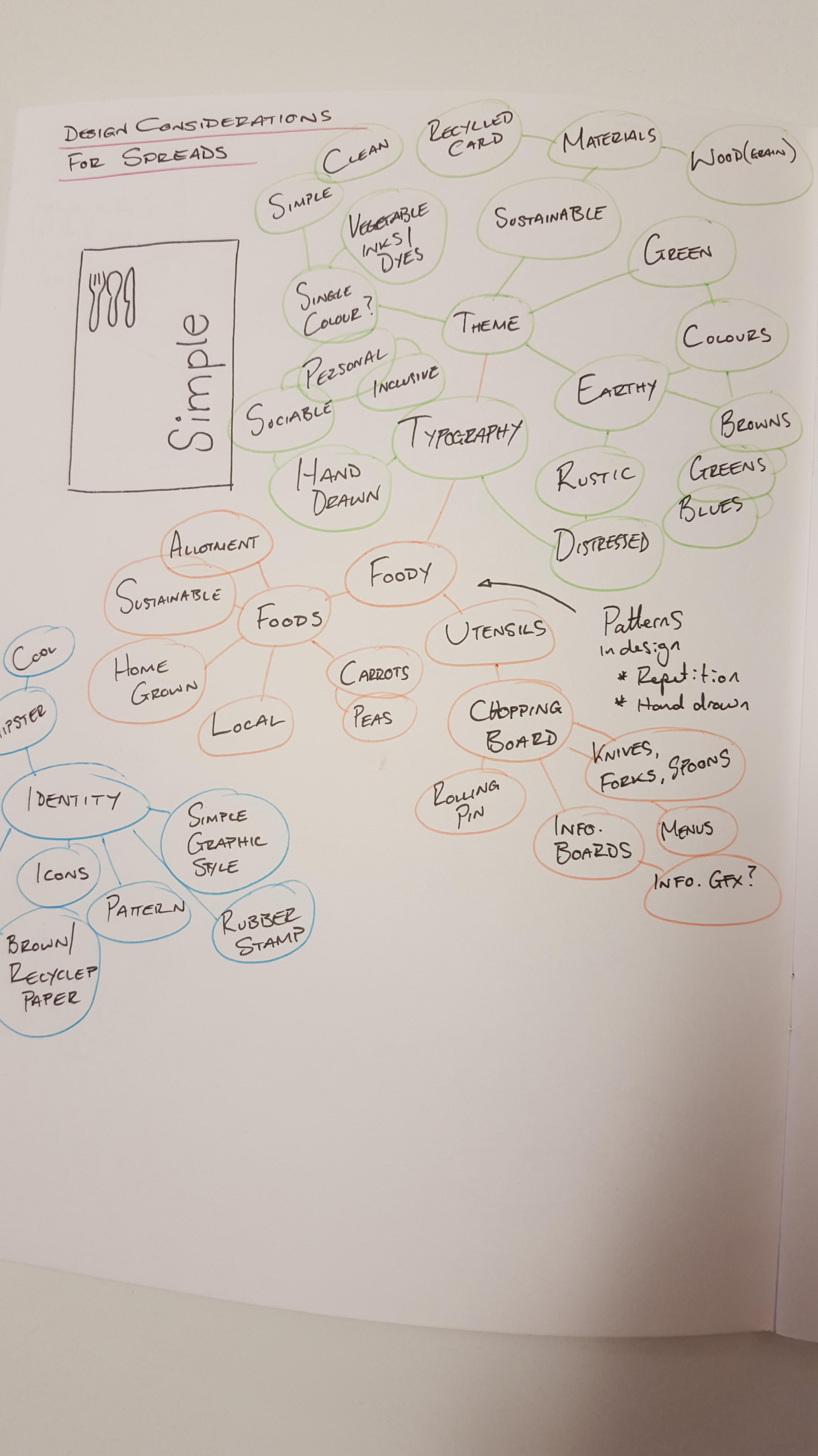
I noticed a theme to the iconography and graphical style used throughout Matthews website – Earthy tones, hand prints (hands on, hand made, eco), floral & hand drawn style typography, warm, rustic/distressed

Other considerations (for our Cob Oven)

How is the cob oven housed/could it be covered for use in all weather?

How high does it stand/could it stand?

How will the space around it be used?  Could we incorporate storage area’s or seating of some description.  The area is intended to be a social hub, so it could be about more than ‘just’ the Cob Oven.

Think of ways that people interact, socialise, drink, eat & play together

Cob House Documentary

Channel 4 made a short film about our cob house and how we built it. Click here to watch it now on 4OD.

(Source – http://www.cobcourses.com/cob-houses/watch-cob-house-documentary/)

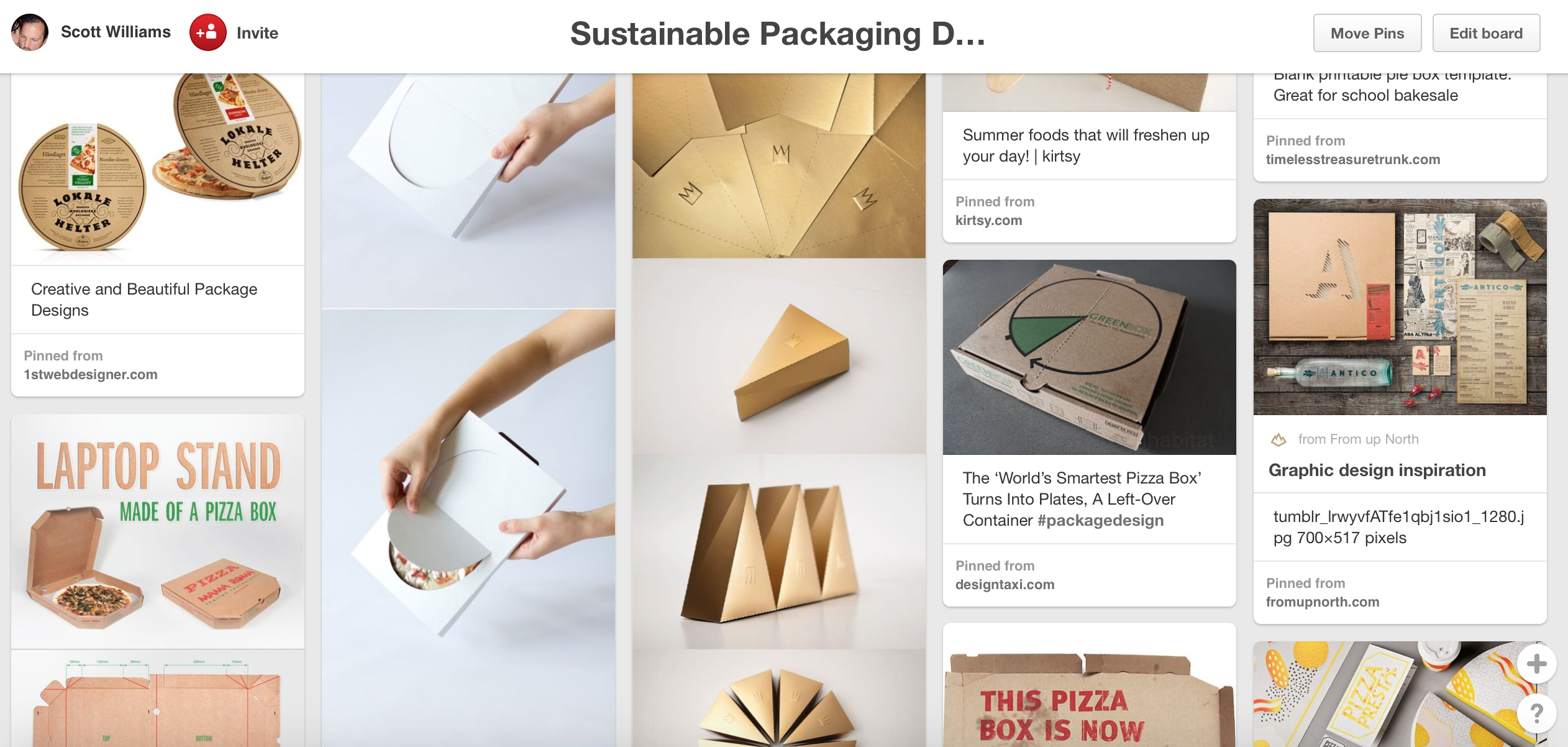
Photo’s of existing designs

I found a number of images online of cob ovens that people have already built.  I selected a variety based on how they had creatively decorated the ovens, considered additional things like storage area’s/facilities, to weather covers and even seated areas.  Lot’s of inspiration to choose from

Other Links

I also found a fantastic board on Pinterest which has loads of inspiration and information on builds, recipes, tips & more – Click here

Ideas for taglines

Matthew uses “Happiness is a Warm Cob Oven”, which I recognise as a reference to a Beatles song title; Happiness is a warm gun.  I like the playful nature of this idea, which is something I could incorporate.  He also references “Soul food” which is another evocative message of warmth, comfort and sharing.

  • Let’s get our cob on!
  • Food to warm your heart.
  • Green living never tasted so good.

Tips/Information for cooking in a Cob Oven

Many hours of cooking …

It takes a morning to fire up the oven, but once it’s up to heat it cooks for many hours, so it’s the perfect party and community activity. With one or two people stoking the fire, the others can work on preparing the food.

If you’re ravenous, the pizzas should be the first to go in as everyone can satisfy their first hunger within minutes. Then you can put in roasting joints, bigger than any one family might consider polite, or heaps of lamb, chicken or vegetables as kebabs or in hunks, on the bone or off.

Flatbreads work brilliantly well in a cob oven, but when it’s fired we also use ours to cook everyday sourdough loaves, baked potatoes and more.

But there’s no need to stick to savouries; sweet pies and tarts and crumbles are great, although you might struggle to make a decent sponge cake. When the oven starts to cool down you could try a tray of meringues. You can also use the last of the heat for drying mushrooms, tomatoes and other vegetables.

Firing the oven

  • You’ll need around 30 to 40 kilos of wood in short stick lengths for a day’s cooking.
  • Start the fire using paper or cardboard and thin pieces of kindling, keep adding kindling until you have a pile of freely burning material then gradually push it back into the body of the oven.
  • Leave the door off so that the fire can get the oxygen it needs, and the smoke can get out. Add sticks every half an hour until the oven has reached cooking heat which can take 3 to 4 hours.

Note: If the fire isn’t getting quite enough air to burn strongly, you can simply drill a few 10mm air holes at the back of the oven near the base to let more in.

  • At this point the outside of the dome will still be barely warm. When you (or an oven thermometer) think the oven is hot enough, rake out the ash and embers into a metal container and put safely out of reach. Then leave the over with the door on for 15 minutes to let the heat equalise.
  • If you’re going to cook directly on the oven floor and are worried about ash on your food, just wipe the oven floor with a wet rag on a stick.

(Source – http://www.theecologist.org/green_green_living/2422014/green_cooking_in_a_cob_oven_and_how_to_build_your_own.html)

What materials are used for fuel in a Cob Oven?

(Note this information is for a product called COBB, but the principles appear very similar)

Mostly wood is used, but different types can be used to add flavour/taste when smoking food.

COBB COBBLESTONE: This fuel is specifically manufactured for Cobb. It is manufactured from a renewable source – Coconut shell, Is quick and easy to light, burns hotter than charcoal briquettes and lasts for approx 2 hrs. (Perfect all rounder for both on plate cooking and general roasting).

ULTRA QUICK: This fuel has the same composition as the Cobblestone and burns for approx 1 1/2 hrs. (Perfect for on plate cooking).

GOOD QUALITY CHARCOAL BRIQUETTES: Use between 6 & 15 briquettes. For more heat use up to 15 briquettes. For baking use only 4-8 briquettes and keep the dome shaped lid on at all times in order to keep the heat in. Burns for approx 3 hrs.(Does not burn so hot as the Cobblestone but works well especially for those longer cook times).

RESTUARANT GRADE LUMPWOOD: Is a perfectly acceptable fuel source, a full fire basket will burn for up to 2 hrs.

DO NOT overfill the fire basket or put fuel in the moat. This will cause a fire and damage your Cobb

Lots of useful FAQ’s answered here.

(Source – http://www.cobb-bbq.co.uk/FAQ.aspx)

Simple Recipes

Cobs can be used to cook all manner of recipes, you can roast, braise, bake, simmer and grill just about anything you can think of:

  • Bread
  • Pizza
  • Roast Meats
  • Vegetables – e.g. Corn on the cob


Pizza Recipe

When people come on our pizza oven building courses they often ask for our secret pizza dough recipe. So we thought we’d share it with you. Charlotte Eve has been perfecting it over the past 10 years and over 4000 pizzas later she thinks she’s got it spot on!

Per person:

3oz plain strong flour

1/2 teaspoon fast action dried yeast

A tiny tip of a teaspoon of sugar

1/2 a teaspoon of salt

1/2 tablespoon olive oil

Some hand hot water

Method:

Sift the flour, salt, sugar and yeast into a mixing bowl. Then add the oil and water.

Mix into a ball and then knead and tear for about 10 minutes. Leave the dough covered in a bowl to rise for an hour and a half.

Then use a sharp knife to cut the dough into individual portions and roll out with a rolling pin. Use plenty of flour to stop your bases sticking. Some people use semolina under the bases to stop them sticking but we find it changes the texture of the pizza so we stick with using flour – we find it does not burn and works well.

Keep your toppings simple. if you want to add veg like peppers and mushrooms roast them first otherwise they release water on top of the pizza and it doesn’t have time to evaporate as your pizza will cook in literally 1 minute in your oven.

Use a pizza peel (you can get these in most cook shops) to slide your pizza into your wood fired outdoor cob oven!

(Source – http://www.cobcourses.com/pizza-ovens/our-pizza-recipe/)

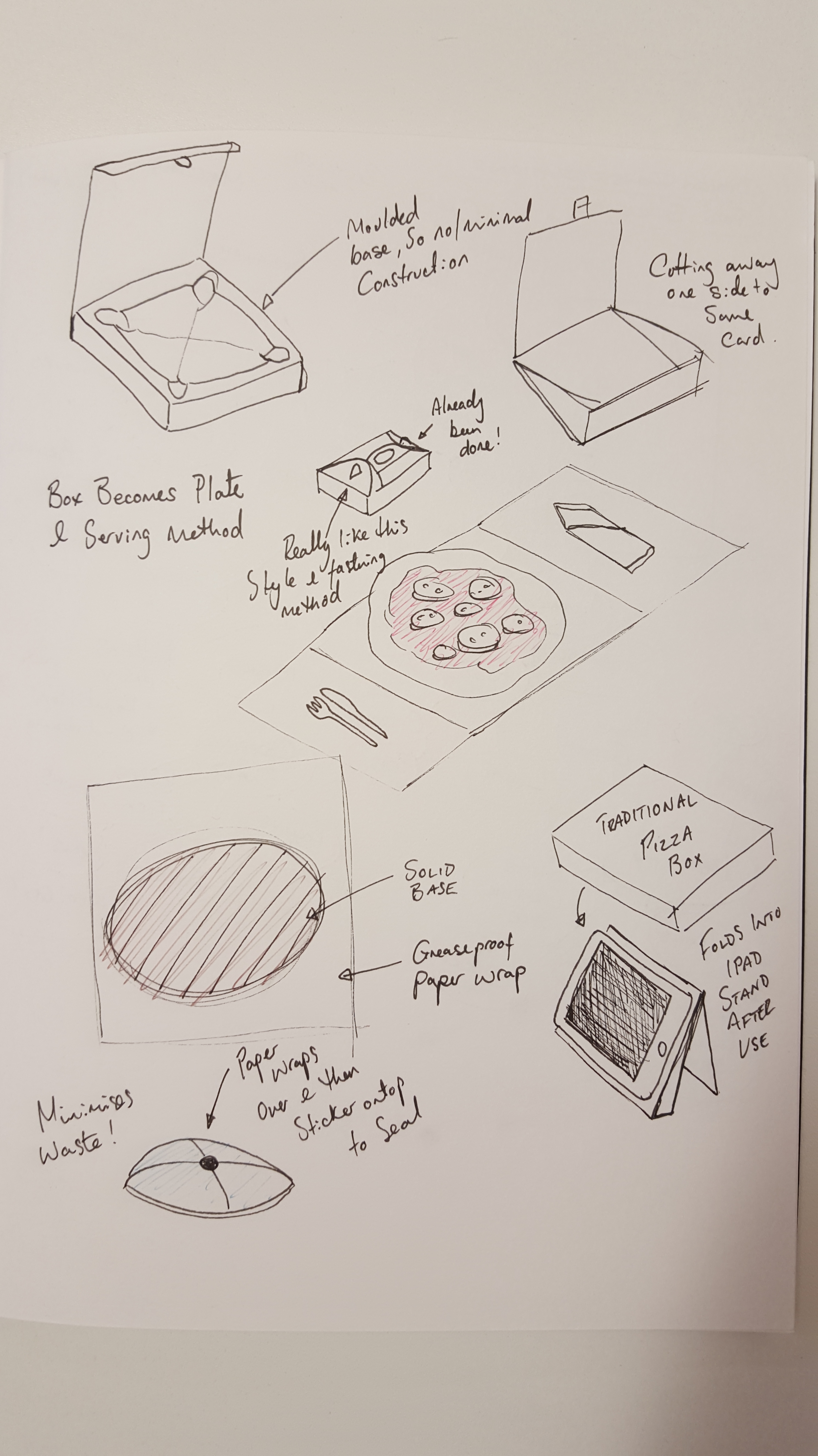
Things related to Cob Ovens/Cooking that could influence 3D artefact

Cooking utensils –

GDES3003 – Green Design – Major Brief – Initial Research

GDES3003 – GREEN DESIGN – MAJOR BRIEF

My notes based on: The Brief

The University of Worcester’s on site student allotment is both a place of retreat – as well as providing a regular supply of fresh, home-grown, produce for student use. Interest in the allotment from students is on the rise and the University’s Sustainability team are looking to help transform part of it into more of a ‘social space’ as well as it’s food-growing role. The aim is to have some of this produce prepared and used in simply-prepared food dishes that are easy for students to achieve (such as pizzas and roasted dishes) some of which is possible next to the place it was grown. In order to achieve this, the Sustainability team have identified a suitable existing concrete floor space within the allotment to build an earthen (Cob) oven – and (ultimately) a small sheltered area surrounding it. The hope is that this will become an additional outdoor social space facility for sustainability students that helps transform local produce into simple, healthy and tasty meals to be enjoyed in a shared, social scenario.

Partnering this facility, your client requires a set of clear, easy to read, e-resources and physical assitive artifacts that can help explain best practices for oven use, maintenance and simple to prepare recipes.

Client

Katy Boom – The sustainability course team, University of Worcester.

http://www.susthingsout.com

Key objectives

  • Provide the clients with a set of  informative e-resources, to include;
    • 2 A4 content pages, suitable for individuals who both use and maintain their cob ovens.
    • Should be colour and A4 in format (multi-page .pdf document).
    • Appropriate for audience range :
      • Primary – Sustainability students.
      • Secondary – The Client & UW Sustainability team.
    • Content should be generating from research & investigation.

Submission

  1. Multipage .pdf e-document consisting of  front & rear cover plus 2 pages of content from:
    • Intro page
    • About
    • How to use your oven effectively
    • How to prep and cook a simple small pizza
    • 2 other simple (roasted) recipes for Cob Ovens
  2. Front cover
  3. Rear cover – Acknowledgments, logos etc.
  4. 3D Supporting artefact – fold up plate, multi use pizza box etc.
    • Research – recycled board, sustainable packaging & materials (corn starch plastics, vegetable based inks/dyes), glue-less folds, packaging nets.
    • Artefact must be supplied with artwork applied/mocked-up.
  5. Separate imagery for final display boards.

Milestone Deadlines

  • 5th Nov 15 – Roughs deadline (4x concept sketches & supporting notes).
  • 26th Nov 15 – Prototypes dealdine (evidence of final digital artwork).
  • 3rd, 4th Dec 15 – Cob oven build (good photo opportunity – Test firing on the 4th).
  • 10th Dec 15 – Peer Assessment.
  • 14th Jan 16 – Final submission (14.15 – 15.15).


GDES3003 – Green Design – Shoe Box design

GDES3003 – GREEN DESIGN

Shoe Box task – Research

Last week we were asked to find a video, coincidentally I found the Puma “Clever little bag” promotional video.  I say coincidentally because at the end of the lecture we were given the following weeks task, which is to research and design a theoretical prototype multi use shoe/trainer/boot box.  It must also best use ‘recycled’ or ‘natural’ materials only.

So, as always, I start with research.

Existing shoebox designs :

For the most part, existing shoe box designs are fairly similar.  Usually a rectangular box with a lid, sometimes the lid is hinged or the box slides out like a matchbox which is sealed at one end.  There is obviously a reason that most boxes were designed this way – they are easy to store, stack, transport & offer good protection to the shoes inside.  They are however usually oversized and so waste a lot of material, they also have additional packaging inside (tissue paper etc) and they are not always made from recycled or sustainable materials.

I found a number of solutions that use a combination of recycled goods in their construction –or- natural materials in some way.  I used Pinterest to collect my findings, not only of sustainable shoe packaging but also packaging that caught my eye because it was either clever, creative, used sustainable/recycled materials, was multi-use, stackable or just down right cool.

Scott’s Sustainable Packaging Pinterest board

Eco-Packaging Design

I found a few links to pages of cool eco packaging ideas, so I’ve linked them below:

35 Eco Friendly Packaging Designs

50+ Eco Packaging – Blog

Origami & Folding methods

As my design should be easy to assemble and use NO glue, I thought it wise to look at Origami for a few ideas of box shapes that could potentially be suitable.  Below are a few images I found that I like or can envisage as part of my design :

Materials & Use :

My research identified a number of different ‘sustainable’ materials that are used in packaging design.

  • Recycled paper & cardboard
  • Rye (& other) grass
  • Corn seed (plastic substitute)
  • Wood (from sustainable sources)

Green Products – Where are they now?

I also found this article (see link above) which lists a number of the most promising sustainable materials from recent years and shows whether they took off or not.

Coca-Cola – Sustainable Packaging

With green issues being at the fore-front of everyone’s agenda right now, It’s interesting to see how many of the big companies are approaching things.  The above link talks about some of the measures Coca-Cola now have in place.

Considerations for my design :

Now that I have a better understanding of what is already out there in terms of design and materials, I can start to consider my own solution.  Below are a few of my considerations to act as a reminder when I am sketching down ideas.

  • These boxes will need to both easy to transport and stack together.
  • They must protect the shoes
  • Provide a suitable secondary use for the packaging after transportation to the purchaser’s home/it’s primary use.
  • Keep it simple
  • No glue should be used in the construction
  • Consider origami & folding methods


GDES2014 – London Book Fair 2015

GDES2014 – Children’s Book Design

London Book fair – 2015

As part of this module we were offered a trip to London to see visit the book fair. This was an opportunity not to be missed, particularly as this task represents children’s literature which was well represented at the show.

The show was massive, with an overwhelming number of exhibitors, but I took along my camera to take snaps of some of the more interesting or innovative developments within the industry as a whole as well as in children’s book design.

We were set the task of finding 3 innovations in children’s book design, which was easy as there was so much to choose from. I will talk a little about some of the things I found below:

The first innovation that caught my eye was this series of “shine a light” books.  The books are designed so that when certain pages are held up to the light, they allow light to shine through in various areas, revealing an otherwise hidden image.  You can see this demonstrated below, and how it works on the following page.

Another innovation I was drawn to (partly due to my love of all things Star Wars) was these books and more specifically the special editions that came with really cool cases/displays.  There are 3 books in the series so far – Jedi, Sith & Bounty Hunter, each with it’s own display case.  They are motorised and with sound effects.  They do however make the books rather expensive and so would only really appeal to serious collectors, cool none the less.

These pictures show another two books I found interesting. The first features glow in the dark print so that the illustrations and words glow when the lights are turned down.  Being black an white, it’s very high contrast and so is easily read in the light too… very effective.  The second book features tabs throughout the book that you can lift to get a glimpse into the past, both informative and fun.

I got talking to a guy who ran a publishing print company. After explaining to him that I was studying graphic design and had a real passion for all things print, he went on to show me all manner of wonderful printing methods.  The opportunities to create something wonderful are endless, although unfortunately only possible on large print jobs due to the cost involved in setting up the machinery.

The Imperial War Museum were there and had a nice little display of some of their books relating to World War 1 & 2. I got chatting with the lady who was able to show me the prototype of a Churchill recipe book that is in development, very interesting to see. There were also a few books there that were beautiful, not to mention the old style typewriter.

There was so much to see and so much to take inspiration from.  A great day out and a good opportunity to get a little insight into the industry and see all of the top publishers under one roof.

GDES2014 – Children’s book design – Main brief part 5

GDES2014 – Children’s book design

WW1 recipe book – Researching children activity sheets

Part of the brief is to produce an activity sheet for children to complete, that ties into the theme of the spread and the book covers.

Puffin Books have a whole section of their website dedicated to children activity sheets, often based on the most well know characters like Willy Wonka or Diary of a Wimpy Kid.  Some of the activities include:

  • Plan a birthday party, with invites and create your own Willy Wonka top hat.
  • Wimpy kid – follow the lines to connect 2 items, spot the difference, suduko, colour in a kids shirt, how many words can you make from the phrase “Summer-Holiday”?
  • Charlie & Lola – Design Lolas dress, colour in silly hats, snap.
  • Others include colouring sheets, mazes, stickers, certificates, hidden objects etc.

http://www.puffin.co.uk

I like the idea of a certificate or award that the child can personalise.  I think an activity sheet with multiple things to do would be fun.

  • Pull the pin from the egg grenade
  • Make words from “Victory in the Kitchen”
  • Something to do with carrots or vegetables
  • Decorate your own egg etc
  • Recognise the different nations by plane markings
  • A mix of interesting facts and activities?

I found a number of examples of activity sheets that I like or could use in the creation of my own.


GDES2014 – Children’s Book Design – Main brief part 4

GDES2014 – Children’s Book Design

WW1 Recipe book brief – Further research

Existing Books

I looked at a number of children books as well as cookery books, Design books and historical references to the First World War.

The Cheeky Monkey book shows a good example of added features with the glove puppet plush toy that goes through the centre of the book.

The Roald Dahl books show very bold colours in the background and type elements, with Quentin Blakes simple illustrations over the top.  This creates a strong divide between the left and right of the cover but is then joined by the book title at the bottom that reads more traditionally (horizontally).

The David Walliams books feature Tony Ross’s amazing illustrations.  Each cover is similarr in that the top banner area is taken up by the authors name and then a large illustration below it.  Again strong colours are used for the backgrounds, but also feature some pattern elements such as stars.  The rosette is a nice touch too, which I may apply to my own design in the form of a medal.

I picked up the other books as they all feature some design elements that I feel may inspire my own cover design.  The Fateful year cover for example, features a lot of semiology to the time period from the type, to the illustration style, washed out colours and patriotic theme (flags, English Rose, Poppies etc).  I like the idea of using silhouettes as featured on “stories of the first world war”, perhaps in the form of a farmer digging, soldiers marching to war, standing over a grave etc.

The Line of Fire book is an illustrated diary and features a really nice, rough illustration style, which captures the gritty/dark nature of the time period.


GDE2014 – Children’s Book Design – Main brief Part 3

GDE2014 – Childrens Book Design

WW1 recipe book brief – Further research

20th Century Design Movements – Timeline

1850-1914: Arts & Crafts Movement

1880-1910: Art Nouveau

1897-1905: Vienna Secession

Modernism

1907-1935: Deutscher Werkbund

1909-1930: Futurism

1916-1923: Dada

1917-1935: Constructivism

1917-1931: De Stijl

1919-1933: Bauhaus

Economic and Political Influences

The beginning of the twentieth century was fraught with radical political, social, cultural and economic changes. It was a revolutionary time. It was a time of major scientific and technological advances. Life was being forever changed by the invention of the automobile, aeroplane, motion pictures, radio and weapons (tanks, machine guns, chemical and biological warfare). Art Deco was a reaction to the rigours of World War I and was an attempt to develop a more positive and contemporary society.

Indeed the subject matter of a lot of Art Deco posters were designed to celebrate society’s progress in technology. The world wars had a significant impact on graphic design. Poster design during

World War 1 was highly influenced by political views and national pride. Propaganda was used to spread a message to the audience, as the war was the main focus of society.

patriotic

The poster design sample in Figure 3.29 demonstrates the designer’s attempt to influence the audience by draping a woman in a flag and using provocative language to send a message to the viewers. The period between the world wars saw a society in disarray and economies in ruin.


Source – https://visscom.wordpress.com/2013/04/07/20th-century-design-movements/

I then further researched each of these movements individually to see if I could incorporate the design style into my design.  The movements that are of most interest to me from an aesthetic viewpoint are Modernism in general, Dada and Constructivism.  Constructivism lends itself particularly well to the time period as it featured heavily in propaganda of the time, most notable Russian.

Modernism

With the advances of technology Modernism began to break through at the end of the 19th century into the beginning to the 20th century. Western society began to develop new ways to shape human culture and improve the constructed environment.

Modernism covered many creative disciplines from design and art to influencing architecture, music and literature. The power of machines forced artists to strategically re-think their practice, the results were revolutionary and still influences designers to this very day. This new technology provided the opportunity for mass production, and the machine itself became a theme in modernism.

Influential designers of this period range from Walter Gropius from the Bauhaus to the modern architect Le Corbusier, both men were fascinated with all disciplines of design and it reflected greatly in their work.

Modernism is arguably being the most influential movement of the 20th century.

Kandinsky

A beautiful poster celebrating the use of sans-serif typography and white space

Graphic Design and Typefaces

Modernism especially changed the thinking process for communications, graphic design and typography, the style of design shifted drastically from the prior 19th century approach. Before the concept of Modernism, graphic design and typography was ‘overly decorated’ and elaborate, every possible inch of a typical poster would be filled with imagery and type.

Designers of the era of Modernism abided to strict, structured grid system with emphasis on negative space, just as important was the use of clean sans-serif type. The idea was to create strong graphics that were against commercialism, greed and cheapness.

Typical typefaces used in the Modernism era include:

Franklin Gothic,

Monotype Grotesque, (cannot find free version)

Futura,

Helvetica Neue.

Dutch artist Theo van Doesburg practiced painting, architecture and poetry – he also influenced graphic design and is considered the ‘ambassador’ of the movement De Stijl. He described Modernism times as: “Art should not deal with the ‘useful’ or the ‘nice’, but with the ‘spiritual’ and the ‘sublime’. The purest art forms do not cause the decorative change of some detail from life, but the inner metamorphosis of life, the revaluation of all values.”

Source – http://www.creativebloq.com/graphic-design/easy-guide-design-movements-modernism-10134971

Jan Tschichold copy

Jan Tschichold (1902 – 1974 ) was born in Leipzig, Germany. Tschichold moved to the center stage of graphic design as a major champion of the modern typographic style during its infancy. But it is his later work—which had moved on from the exclusive use of asymmetrical design and sans serif typefaces, to a classical approach—that caught the eye of Penguin founder Allen Lane during the late 1940s, leading to three years of Tschichold holding the creative reins of the infamous publishing house.

When Jan Tschichold designed his posters he widely expresses the avant-garde ideas of the or New Typography, which were strongly influenced by the Bauhaus.

Source – http://guity-novin.blogspot.co.uk/2012/03/history-of-type-face.html#Eleven

Dada

M4623685613e50b9586bbfd0b5f97993f

The collage artists, Max Ernst, Man Ray and others taking the clue from Cubism were instrumental to the development of the movement called Dada. Dada was an early 20th-century international movement in art, literature, music, and film, repudiating and mocking artistic and social conventions and emphasizing the illogical and absurd. Dada was launched in Zurich in 1916 by Tristan Tzara and others, soon merging with a similar group in New York. It favored montage, collage, and the ready-made. Leading figures: Jean Arp, André Breton, Max Ernst, Man Ray, and Marcel Duchamp.

Constructivism

rodchenko_books

A movement with origins in Russia, Constructivism was primarily an art and architectural movement. It rejected the idea of art for arts’ sake and the traditional bourgeois class of society to which previous art had been catered. Instead it favored art as a practise directed towards social change or that would serve a social purpose. Developing after World War I, the movement sought to push people to rebuild society in a Utopian model rather than the one that had led to the war.

The term construction art was first coined by Kasmir Malevich in reference to the work of Aleksander Rodchenko. Graphic Design in the constructivism movement ranged from the production of product packaging to logos, posters, book covers and advertisements. Rodchenko’s graphic design works became an inspiration to many people in the western world including Jan Tschichold and the design motif of the constructivists is still borrowed, and stolen, from in much of graphic design today.

Source – http://www.designishistory.com/1920/constructivism/

De Stijl

039/ML

039/ML

Dutch for The Style, Die Stijl was founded in 1917. The artists most recognized with the movement were the painters Theo van Doesburg, who was also a writer and a critic, and Piet Mondrian, along with the architect Gerrit Reitveld. The movement proposed ultimate simplicity and abstraction through which they could express a Utopian idea of harmony and order.

The harmony and order was established through a reduction of elements to pure geometric forms and primary colors. Die Stijl was also the name of a publication discussing the groups theories which was published by van Doesburg. The publication Die Stijl represents the most significant work of graphic design from the movement, but the ideas of reduction of form and color are major influences on the development of graphic design as well.

Source – http://www.designishistory.com/1920/de-stijl/

Futurism

logbookcover

Futurism was not only an art movement but also a social movement that developed in Italy in the early 20th century. Futurists were well versed and practiced in nearly every field of art including painting, ceramics, sculpture, graphic design, interior design, theater, film, literature, music and architecture. It was a movement that particularly despised not just certain aspects of classical antiquity, but everything that was not totally new.

The painters of Futurism were particularly successful but much of the ideas of the movement were generated through writing and several manifestos of futurism were published. They often broke light and color down into a series of dots or geometric forms through a process called divisionism. Futurism influenced many modern art movements of the 20th century which in turn influenced the development of graphic design. The writings, philosophies and aesthetic characteristics of futurism have been particularly influential to designers.

Source – http://www.designishistory.com/1850/futurism/


GDES2012 – Teme Valley Tour – Part 6

GDES2012 – Graphic Information Design

Concept development – Leaflet 

Part of the brief was to update and simplify the existing tour leaflet.  My idea’s are based around the nature & wildlife of the region, as well as the organic nature of the regions cider production.

The criteria suggested that the leaflet should use an A3 page, but that the format could be determined by ourselves.  I spent some time looking at various different folding options on the internet as well as trying a few out myself that I thought might suit design.

20150508_145135

I tried a variety of different folding techniques to determine the format and style of my design

The original was folded in half then half again, effectively creating 4 individual pages (cover, rear cover & 2 inner pages) which resulted in an A5 sized leaflet.

The pages of the original flyer were very information heavy and so I have simplified this by only including necessary information, placing more emphasis on family activity, walks & cycle routes.

I narrowed down my selection based on the audience requirements and it’s purpose and the content.  Some of the formats were a little too fussy or resulted in the pages being to small, so I incorporated user testing to find out how potential readers would handle the format.  I handed a few of the folded mock ups to friends and family and observed how they unfolded then and how they viewed it.  I found that with the 6 page format that all users unfolded the way I intended and liked the slight smaller format, some commenting that it felt like a CD cover which they liked.   I therefore that my flyer would fold smaller than the original, creating 6 pages with the inside being a gatefold of the map & the featured towns.

The elements that make up the design of my finalised flyer are as follows:

Colour Scheme

  • The main colour scheme is taken from cider apples (red & green)
  • A subtle background pattern is based on the star shape that the seeds leave when an apple is cut in half sideways
  • Each town is colour coded and this is also reflected on the map with individual location markers

Covers

  • Photograph of the Teme Valley, with Elgar’s portrait overlaid to imply his significance to the region
  • Typography modern in style
  • Typeface (Panton) customised to create a valley shape between the V & the A
  • Rear cover features Malvern District Council contact details
  • Large web address
  • Apple image due to regional cider production

Inner pages

  • Typeface Avenir throughout as readability & legibility is good, plus it offers versatility with it’s numerous weights
  • Typeface Panton used for all headings
  • Background llustrations used to create visual interest
  • Wildlife page added to engage readers both young & old and to encourage them to look out for the nature & wildlife in the area
  • Photography of areas of interest throughout the tour

Gatefold

  • The 6 page folding method means that the 5 towns + the map could be placed symmetrically
  • Colour coding to identify each town
  • QR codes & instruction on how to use it
  • Key for colour coded Walks & cycle routes
  • Time Valley Tour logo as visual identifier, used to create a visual system

The following pictures show the development of my sketchbook ideas into illustrator.

Final Flyer layout

Flyer---OutsideFlyer---Inside