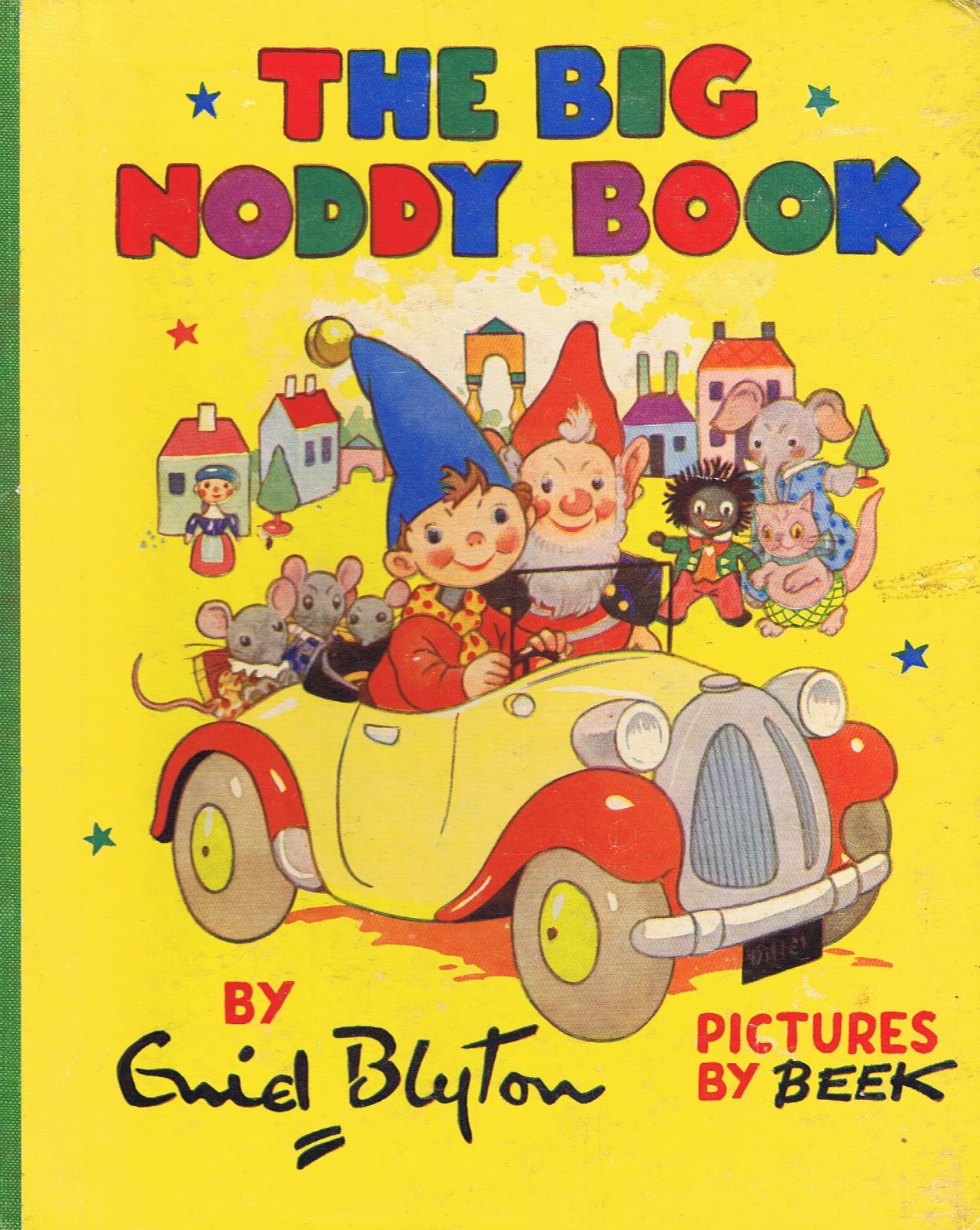
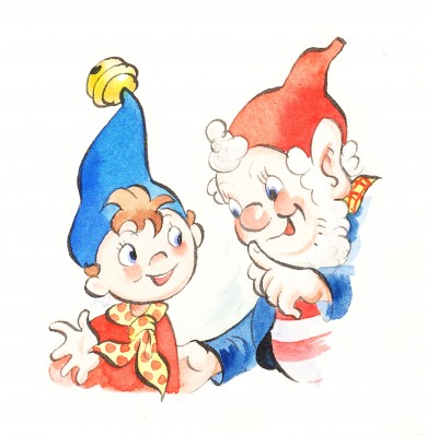
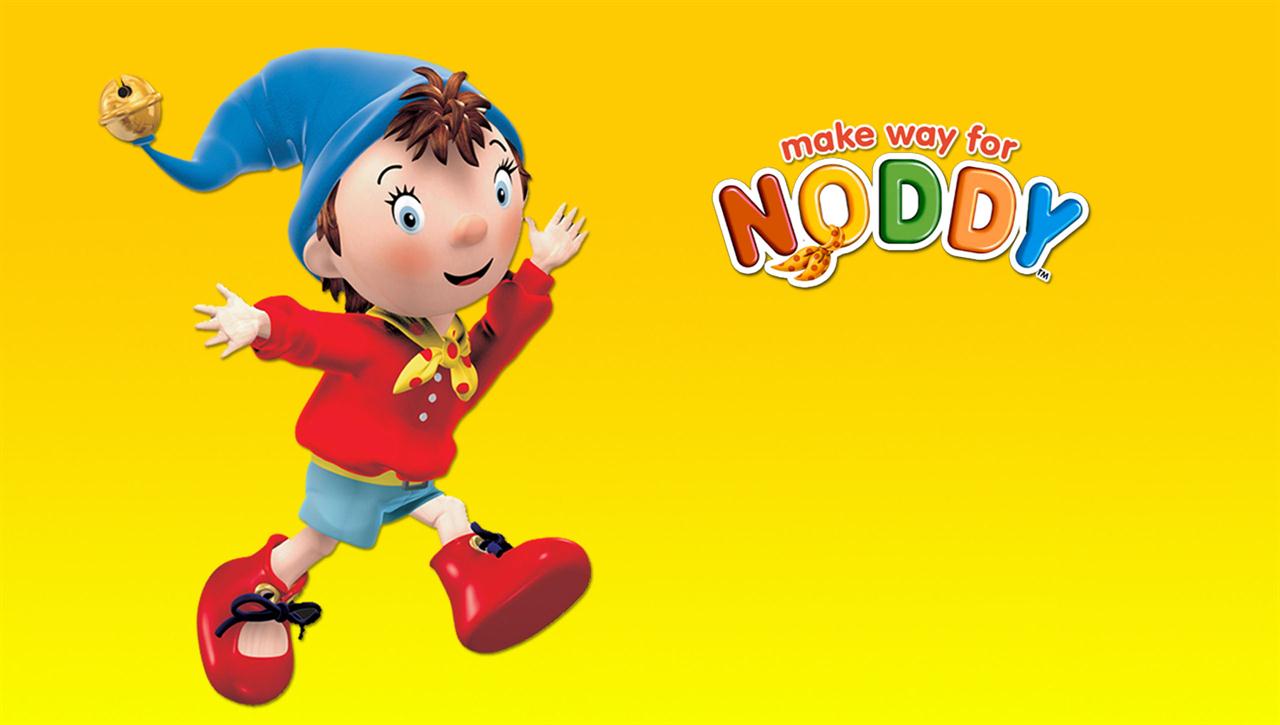
GDES2014 – Children’s Book Design
Main Brief – Research
Grids & layout
As the brief for this module is to produce a spread and a cover for a book, I felt it important to consider effective layout and of course the underlying grid structure.
I found a number of resources online as well as in book from my own collection and from the Hive. I have “pooled” some of that information here.
Using layout grids effectively
There are two main types of layouts: vertical or landscape. There are also only two types of grids. One that has an even number of columns and one that has an odd number of columns. An experienced designer knows that a specific style of design can only be achieved by an odd number of columns, or alternatively, by using an even number of columns. Illustrated below are common examples of layouts using basic layout grids. Learning to choose the right grid for your design is crucial to its success.
Here are examples of basic vertical layout grids
|
1 column vertical grid
|
2 column vertical grid
|
2 column vertical grid
|
|
3 column vertical grid
|
3 column vertical grid
|
3 column vertical grid
|


Here are examples of basic landscape layout grids
|
1 column landscape grid
|
2 column landscape grid
|
|
3 column landscape grid
|
3 column landscape grid
|
|
4 column landscape grid
|
4 column landscape grid
|


Adjusting Your Layout Grid for Your Binding Type
It’s important, as you create your layout grid, that you pay special attention when choosing the type of binding to compensate for the gutter. We’ve all had the experience of losing content in the gutter of a publication, at one time or another, and have learned this lesson the hard way. Illustrated below are examples of a perfect bound spine and a double-page layout grid, where the gutter has been taken into consideration and the proper adjustment made.

The gutter is the blank space between two facing pages. The gutter space is that extra space allowance used to accommodate the binding in publications. It needs special attention because it is not always usable for design and will affect legibility in most cases. For example, a perfect bound spine will take about a ¼” for the glue, so you should consider the first ½” as non-usable. Any type of Wire-O™ or spiral binding, which make it possible for the document to lay flat when open, will have either drilled holes or punched squares for you to consider. With these specific bindings, the first 3/8” should be considered as not usable or illegible space. On the other hand, the gutter of a saddle stitch binding will not have this problem and can easily have an image or text run though it without any legibility issues.
The Rule of Thirds
This rule is used by professional photographers the world over. The rule of thirds works by splitting an image into thirds, so you end up with 9 equal sections, then simply place your main subject where the lines intersect.

The Golden Ratio and the Fibonacci Sequence
The Golden Spiral is based on the Golden Ratio while the Fibonacci Spiral is a spiral based on the Fibonacci Sequence. Both are very similar, and can be used as a compositional tool.
|
The Golden Spiral
|
The Fibonacci Spiral
|


The Golden Ratio is also known as the divine proportion. In mathematics and the arts, two quantities are in the Golden Ratio if the ratio of the sum of the quantities to the larger quantity is equal to the ratio of the larger quantity to the smaller one. Also In mathematics the Fibonacci Sequence are 0 and 1, and each subsequent number is the sum of the previous two: 1, 1, 2, 3, 5, 8, 13, 21, 55, 89,144, etc.
The whole concept of a definitive grid ‘system’ is a relatively recent invention in the world of design. Grids have existed intuitively since the earliest days of man drawing and writing, but it’s only recently that layout has been considered in a scholarly fashion, and as such they’ve never existed in isolation from other best-practice, well understood layout tools. One such example of cross-over is where the golden ratio meets the grid.
The golden ratio (also known as the golden mean) determines the most pleasing set of proportions for an element, and is simplified to the ‘rule of thirds’. When used in combination with a grid, these simple rules for size, position and proportion can help ensure a layout feels both coherent within itself, but also appealing aesthetically. Why would you want to appeal in these terms? Because by doing so, you’re making the content more accessible to the reader. Remember that a grid is the invisible glue behind content – in most cases it should be transparent to the viewer.
Source – http://www.creativebloq.com/web-design/grid-theory-41411345
My Pinterest boards
I use Pinterest as a source of inspiration for all of my projects, so rather than post too many pictures here you can have a look at my image research by following the links listed below.
Book Cover Design

link – https://uk.pinterest.com/scottrw2002/book-cover-design/
Layout Design

Link – https://uk.pinterest.com/scottrw2002/layout/
Publication Design

Link – https://uk.pinterest.com/scottrw2002/publication-design/